When the Room Breathes: The Case for Restraint in Immersive Design
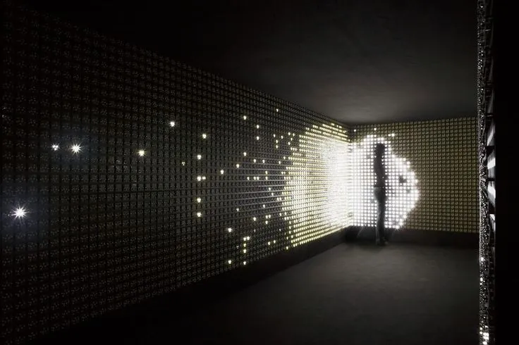
Photo: minimalist virtual reality installation dark exhibition space single light, via i.pinimg.com
There is a moment in nearly every well-designed virtual reality installation, museum gallery, and flagship retail activation that goes largely undiscussed: the moment when nothing happens. The ambient hum recedes. The floating interface elements fade. The user, often for the first time since putting on a headset or entering a projection room, simply stands still.
It would be easy to mistake this for a failure of the design. It is, in fact, its highest achievement.
The Compulsion to Fill
Spatial design carries a temptation that flat design never quite did. A screen has edges; a volumetric environment does not. When the canvas is a 360-degree sphere, the instinct — for brands and, frankly, for many designers — is to populate all of it. Every surface becomes a potential touchpoint. Every silence becomes an invitation for another layer of audio, another particle effect, another prompt begging for engagement.
The result is a category of experiences that are technically impressive and emotionally exhausting. Visitors to trade shows across Las Vegas and Orlando have felt it: the immersive booth that dazzles for ninety seconds and then becomes a room you want to leave. The AR shopping tool that offers eleven features when three would have converted. In our eagerness to demonstrate capability, we have built environments that treat attention as something to be captured rather than cultivated.
Silence as a Structural Material
The most thoughtful practitioners of spatial design have begun treating absence the way architects treat a courtyard — not as unused space, but as the element that gives everything around it meaning.
Consider the museum context. Institutions like the Smithsonian have long understood that gallery pacing matters: a dark, quiet anteroom before a bright, densely packed exhibition hall heightens the impact of both. Immersive designers are now translating that same logic into digital environments. A VR brand story that withholds its central reveal for thirty seconds — no music, no guidance, just ambient spatial audio of wind or distant water — earns an emotional response that no amount of layered spectacle can buy.
In retail, the lesson is even starker. Virtual showrooms that resist the urge to animate every product consistently outperform their busier counterparts on dwell time and recall. The product that sits calmly in a well-lit virtual space, inviting inspection rather than demanding it, reads as confident. The product wreathed in orbiting callouts and looping motion reads as anxious. Consumers, whether they can articulate it or not, notice the difference.
The Practical Discipline of Doing Less
Restraint in immersive design is not an aesthetic preference; it is a strategy with measurable consequences.
First, there is cognitive load. Research on presence consistently shows that users' sense of immersion degrades when an environment demands more simultaneous attention than they can give. A spatial experience is not a dashboard — it cannot be scanned. Every additional stimulus competes for the same finite pool of focus, and the environment itself becomes the distraction.
Second, there is the problem of guidance. In flat interfaces, we rely on hierarchy: headers, buttons, whitespace. In three dimensions, hierarchy must be built through light, sound, and motion — and if everything glows, nothing does. Designers who master restraint learn to use a single moving element, a single sound source, a single point of illumination as a compass. The user is never told where to look. They simply know.
Third, there is longevity. Feature-stuffed activations age quickly; their density dates them the way overproduced commercials do. Spare, well-paced environments remain legible — and impressive — for years.
Building Pauses Into the Process
For teams designing immersive work, restraint must be engineered, not hoped for. A few practices have proven reliable:
- Design the silence first. Before adding a single interactive element, map where the experience will deliberately offer nothing — the rests between movements. If a pause cannot be defended, neither can the content surrounding it.
- Audit every layer against presence. For each sound, effect, or prompt, ask whether it deepens the user's sense of being in the space or merely announces the design team's effort. The second category is usually removable.
- Test for fatigue, not just delight. Session-length data, gaze scatter, and exit interviews reveal what telemetry alone cannot: where users feel managed rather than invited.
- Give the user permission to do nothing. The best spatial environments accommodate the person who wants to stand still, look around, and simply be there. That person is not failing to engage. They are engaging on their own terms.
The Confidence of Emptiness
There is a cultural dimension here as well. American audiences, marketed to from every direction — every screen, every shelf, every sidewalk — have developed a refined sensitivity to being sold to. Immersive environments that never stop performing trigger that sensitivity instantly. Environments that breathe, that trust the user to approach rather than chasing them, read as a different kind of brand altogether: one secure enough to be quiet.
The next frontier of immersive design will not be won by whoever renders the most particles or layers the most audio channels. It will be won by teams confident enough to leave space in the sphere — to let a virtual room sit still long enough for a visitor to feel something on their own.
Silence, it turns out, is not the absence of design. Done well, it is the loudest thing in the room.


